 CSS 属性
# mix-blend-mode
元素背景混合 属性值 (opens new window)
<style>
  .post {
    position: relative;
    width: 200px;
    height: 200px;
  }
  .circle {
    position: absolute;
    width: 100px;
    height: 100px;
    border-radius: 50%;
    mix-blend-mode: screen;
  }
  .red {
    background-color: red;
    left: 0;
    top: 0;
  }
  .green {
    background-color: green;
    left: 50px;
    top: 0;
  }
  .blue {
    background-color: blue;
    left: 25px;
    top: 50px;
  }
</style>
<div class="post">
  <div class="circle red"></div>
  <div class="circle green"></div>
  <div class="circle blue"></div>
</div>
# scroll-snap-*
- scroll-snap-align 属性将盒子的吸附位置指定为其吸附区域(作为对齐对象)在其吸附容器的吸附口(作为对齐容器)中的对齐方式。其两值分别指定了在块向轴盒行向轴上的吸附对齐方式。若仅指定一值,则第二值默认为同一值。
- scroll-snap-stop 定义了滚动容器是否可“越过”吸附位置
- scroll-snap-type 设置了在有滚动容器的情形下吸附至吸附点的严格程度。
# accent-color, color-scheme
accent-color 自定义强调色,color-scheme 可设置“亮色”和“暗色”模式
<style>
  body {
    color-scheme: dark; /** dark light normal */
  }
  input {
    accent-color: auto;
    display: block;
    width: 30px;
    height: 30px;
  }
  input.custom {
    accent-color: red;
  }
</style>
<input type="checkbox" checked /> <input type="checkbox" class="custom" checked />
# CSS 字体
- capitalize uppercase lowercase 元素的文本大小写
text-transform: capitalize;
# initial-letter
实现首字下沉效果,只能运用于块容器首行首字上,还需要配合 css 的伪元素::first-letter 一起使用
<style>
  div::first-letter {
    color: #bf4055;
    initial-letter: 3 3; /** 值1:表示的行高;值2:表示沉度。 */
  }
</style>
<div>实现首字下沉效果,只能运用于块容器首行首字上,还需要配合css的伪元素::first-letter一起使用</div>
# CSS 自定义属性
属性名需要以两个 -- 开头
--color99: #f00;

var(--color99);
/* 使用js修改css属性值 */ <style> div { --color: #666; color: var(--color); } </style> <div style="--color: #00ade1">color</div> <script> document.querySelector('div').setAttribute('style', '--color: #f00') </script>
# CSS 逻辑属性和逻辑值
定义文本阅读方向
direction: ltr /** 默认值,让文本和其他元素从左到右显示 或者在标签设置 dir 属性 */

writing-mode /** 定义了文本水平或垂直排布以及在块级元素中文本的行进方向 */

/** Y轴方向的属性为 block,X轴方向的属性为 inline */
padding-block-start
padding-inline-start

margin-block-start
margin-inline-start

inset-block-start:0;  /*top - in English*/
inset-block-end:0;    /*bottom - in English*/
inset-inline-start:0; /*left - in English*/
inset-inline-end:0;   /*right - in English*/
inset:0 0 0 0;   /*top, right, bottom, left - in English*/

text-align: start;
float: inline-start;
float: block-start;
# 滚动条
- 设置滚动条
/** 隐藏 */
.hide-scrollbar {
  -ms-overflow-style: none; /* IE10+ */
  scrollbar-width: none; /* Firefox */
  &::-webkit-scrollbar {
    display: none;
  } /* Webkit */
}
# 多行文本超出使用…
- 文本超出
.text-overflow(@clamp: 1) {
  display: -webkit-box;
  overflow: hidden;
  text-overflow: ellipsis;
  -webkit-line-clamp: @clamp;
  -webkit-box-orient: vertical;
}
# CSS 宽高比
aspect-ratio
<style>
  img {
    aspect-ratio: 16 / 9; /** width / height */
  }
</style>

<img src="xxx.png" / >
使用 position 和 padding
<style>
  .box: {
    position: relative;
    padding-bottom: 56%;
    img: {
      position: absolute;
      left: 0;
      top: 0;
      width: 100%;
      height: 100%;
    }
  }
</style>
<div class="box">
  <img src="xxx.png" />
</div>
# CSS 锥形渐变 conic-gradient
锥形渐变
<style>
  div {
    width: 100px;
    height: 100px;
    border: 1px solid;
    background: conic-gradient(red, orange, yellow, green, blue);
    background: conic-gradient(
      red 6deg,
      orange 6deg 18deg,
      yellow 18deg 45deg,
      green 45deg 110deg,
      blue 110deg 200deg,
      purple 200deg
    );
    background: conic-gradient(#fff 0.25turn, #000 0.25turn 0.5turn, #fff 0.5turn 0.75turn, #000 0.75turn) top left / 25%
      25% repeat;
  }
</style>
<div></div>
# CSS 滤镜
filter 属性将模糊或颜色偏移等图形效果应用于元素
<style>
  div {
    width: 100px;
    height: 100px;
    filter: blur(5px);
    background-image: url();
  }
</style>
<div></div>
backdrop-filter 属性可以让你为一个元素后面区域添加图形效果
<style>
  .post {
    width: 100px;
    height: 100px;
    background-image: url();
    background-size: contain;
  }
  .filter {
    backdrop-filter: blur(5px);
    height: 40px;
  }
</style>
<div class="post">
  <div class="filter"></div>
</div>
background: inherit 配合 filter 可实现与背景相匹配的阴影
<style>
  .box {
    position: relative;
    width: 200px;
    height: 200px;
    background: #fff;
    border-radius: 35px;
    background-size: cover;
    background-image: url(./2.svg);
    margin: 30px;
  }
  .box::before {
    content: '';
    position: absolute;
    top: 20px;
    left: 0;
    width: 100%;
    height: 100%;
    background: inherit;
    border-radius: 35px;
    filter: blur(15px);
    background-size: cover;
    opacity: 0.5;
    z-index: -1;
  }
  .img {
    width: 100%;
    height: 100%;
    border-radius: 35px;
  }
</style>
<div class="box"></div>
# drop-shadow
drop-shadow 可以让我们给一个元素添加阴影,这个阴影并不对应于它的边界框,而是使用该元素的 Alpha 蒙版可以作用于文字、图片、形状不规则元素,参数与 box-shadow 一样
filter: drop-shadow(0 0 25px red);
# 边框
边框渐变
<style>
  .box {
    width: 100px;
    height: 100px;
    border: 4px solid transparent;
    border-radius: 12px;
    background-clip: padding-box, border-box;
    background-origin: padding-box, border-box;
    background-image: linear-gradient(to right, #fff, #fff), linear-gradient(90deg, #8f41e9, #578aef);
  }
</style>
<div class="box"></div>
# box-decoration-break
设置行盒截断换行的样式
box-decoration-break: clone;
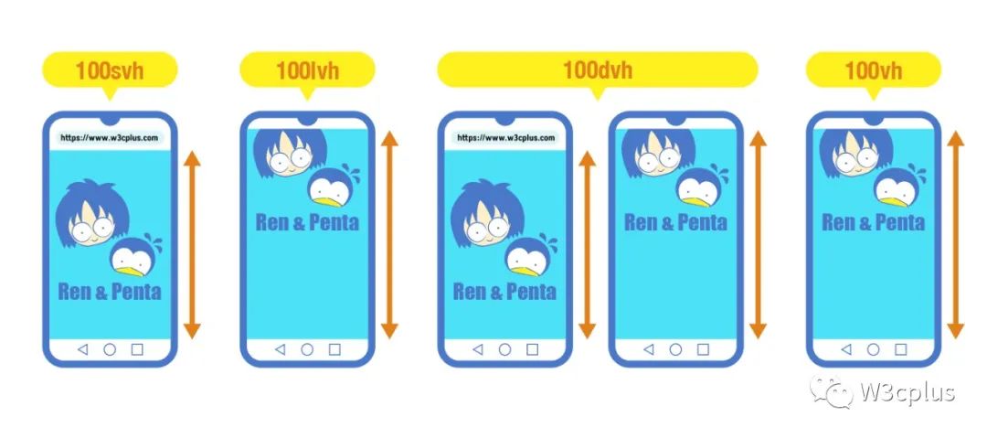
# CSS 单位
vh:在 pc 浏览器上高度和浏览器视窗的高度一样,在手机浏览器上,原本的 vh 视窗单位并不会考虑浏览器工具栏、状态栏和地址栏所占的高度
vmin:选取 vw 和 vh 中最小的那个
vmax:选取 vw 和 vh 中最大的那个
em 被定义为当前对象内文本的字体大小
- 如果给 body 设置了 font-size 字体大小,那么 body 的任何子元素的 1em 就是等于 body 设置的 font-size
- 如果用 em 一层一层级联得定义嵌套元素的字体大小,每一个 div 都从它上一级父元素继承了字体大小,并且逐渐得增加
<style>
  body {
    font-size: 14px;
  }
  div {
    font-size: 1.2em; /*  calculated at 14px * 1.2, or 16.8px */
  }
</style>
<body>
  <div>
    Test
    <!-- 14 * 1.2 = 16.8px -->
    <div>
      Test
      <!-- 16.8 * 1.2 = 20.16px -->
      <div>
        Test
        <!-- 20.16 * 1.2 = 24.192px -->
      </div>
    </div>
  </div>
</body>
ex 定义为当前字体的小写 x 字母的高度或者 1/2 的 1em, 很多时候,它是字体的中间标志,大部分用于版式的微调。比方说,sup 元素(上角文字标)
sup {
  position: relative;
  bottom: 1ex;
}
sub {
  position: relative;
  bottom: -1ex;
}